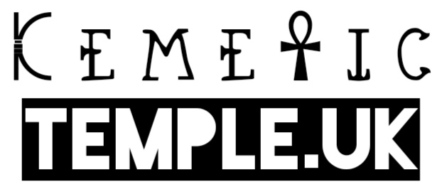
A little about me, I like to design logos and headers etc in my spare time just as a little hobby purely on my phone (I find it easier to navigate) to either polish up something or make it look a little more professional or unique. So this morning I attempted to redesign the Kemetic Temple logo.
Now I understand some people (like my wife) prefer things to look basic and clean like the current logo, there are others like myself who like things to look a little more unique and special. So this isn’t an attempt to replace the current logo but rather get feedback on the communities thoughts of my attempt. Also I don’t mean to offend, upset or degrade anyone by attempting to resign the current logo.
I’ve used two different fonts for my design and incorporating the Ankh as a T. I did try and use a Temple (Column) like font for the word Temple but it didn’t look good and was very clunky looking. I’d appreciate the feedback of what everyone thinks. Now I am off to work so I’ll see any replies later in the evening. I hope everyone has a lovely day today.
Scaling. How does it look if small? Sharp edges tend to get lost and high detail too.
Accessibility: If your sight is impaired in some way and can’t make out complex shapes either due to sight loss or colour issues, would that be a problem? Couple that with change of media such as being in colour vs black and white. Contrast and ease to put on other medium help.
Not putting you off, I do genuinely like those designs and on large scale are quite effective. Good work and keep at it, logo design is a fun thing to do.
If I was to make it simpler it would look like this, although not sure how small the Kemtic Font would look if shrunken down a size. The only problem with this is there is no option to go “Bold”
A very interesting and creative design! I like it on the coloured background but had a slight twitch when viewing it on white. I’m not epileptic but I do have some sort of neurological problems that causes tremors and small seizures. It made my brain fizzy!
Perhaps you could use some of your concepts, like the ankh “t” for a blog on Atenism? I’ve not actually come across anyone reviving his worship before so you might be a bit of a pioneer. Ironically, Revived Atenism is RA lol
Just so you are clear, in case you got the wrong idea. I’m not planning on changing the logo any time soon. That may change with some plans I might announce our the groups next birthday in March - so long as I get all the ducks in a row by then.
Wanted to mention it in case you were rushing to do things. This is a slow burn project from my POV.
Thanks